来源:网络 作者:Fabian Barszcz


Hi dribbblers! Some time ago I’ve been working on a new design for one of our old clients. This is one of my first projects representing a new team and it was awesome! #tonikpany
What is Upshift? Founded in 2012, Upshift is SF-based startup offering a new model of carsharing: usage-based car subscriptions, an easy alternative to owning a car. Their plans include everything you need like full coverage insurance, maintenance, and roadside assistance. Whenever you need a car, they deliver a new clean Prius or an SUV with a full tank of gas. You can check them out here
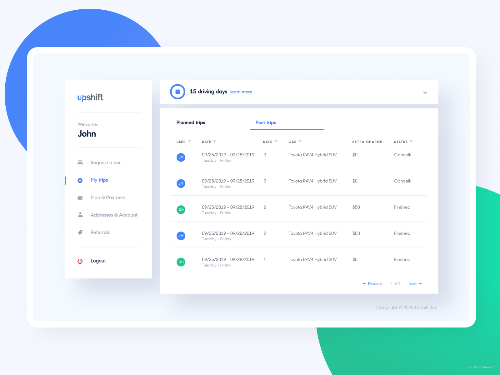
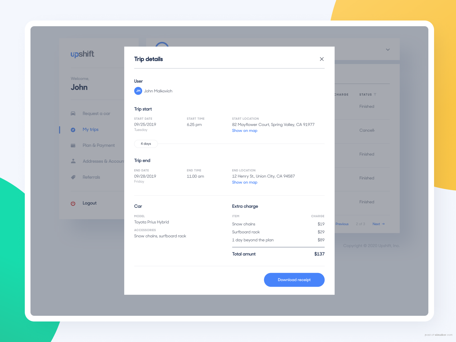
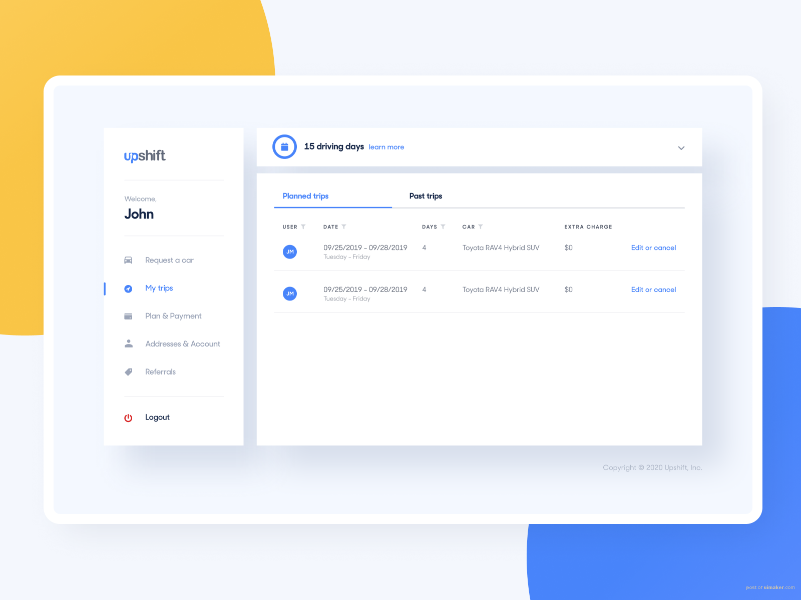
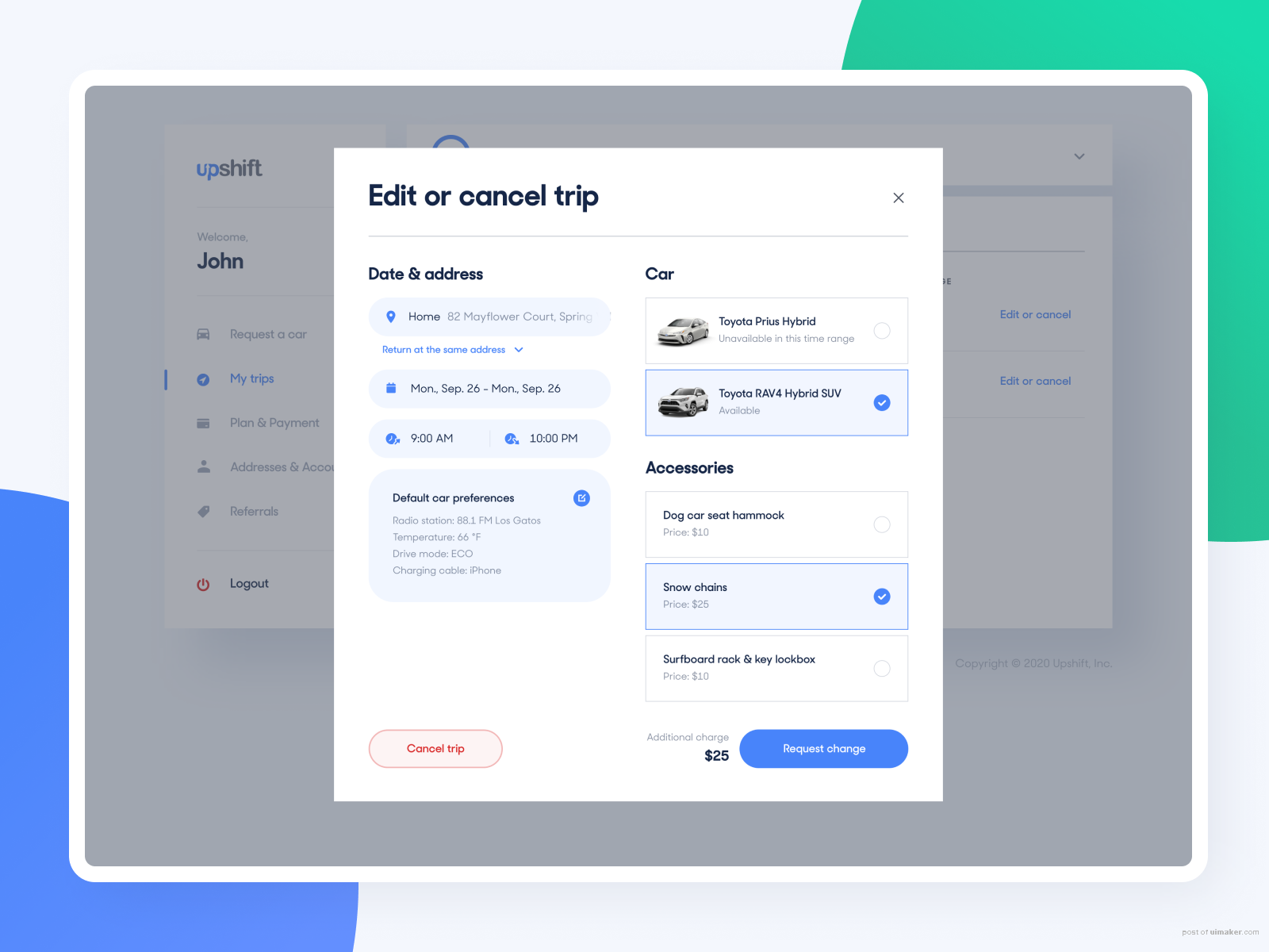
How did we help? We were asked to redesign the entire web app and sign-up flow to match the website design we’ve made last year. The challenge with the app was to create a simple yet functional interface to let users manage their accounts and cars easily. The goal was to make users feel like opening the app and choosing cars like they are in their garage. The new sign-up flow on the other hand was created to collect users’ data smoothly, ensure they understand the functionality, and reject junk leads.
―――
Thanks for watching! Remember to follow our profile for more!
Let’s talk about your project ― ,UI设计教程及步骤,UI设计自学