来源:网络 作者:Damon Charles

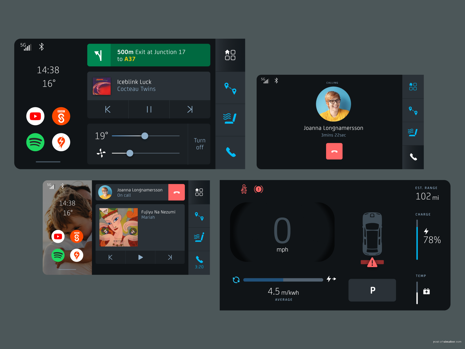
A few more work in progress shots of a personal project. This is a dual-screen UI concept for an electric car. It’s for a UK (right hand side drive) mass-market family car.
A few notes : – Based on a screen size of an average consumer 16:9 tablet – Two screens side by side – Extra large hit areas for interactive elements – All critical text at least 38pt – Navigation never more than one level deep – Second screen home is based on a feed of items ordered by priority (Comms & navigation always appear top) – Feed items scale depending on context – Designed assuming volume control is physical – Customisable app panel background
,UI设计图标教程,如何自学UI