来源:网络 作者:Laurent Baumann

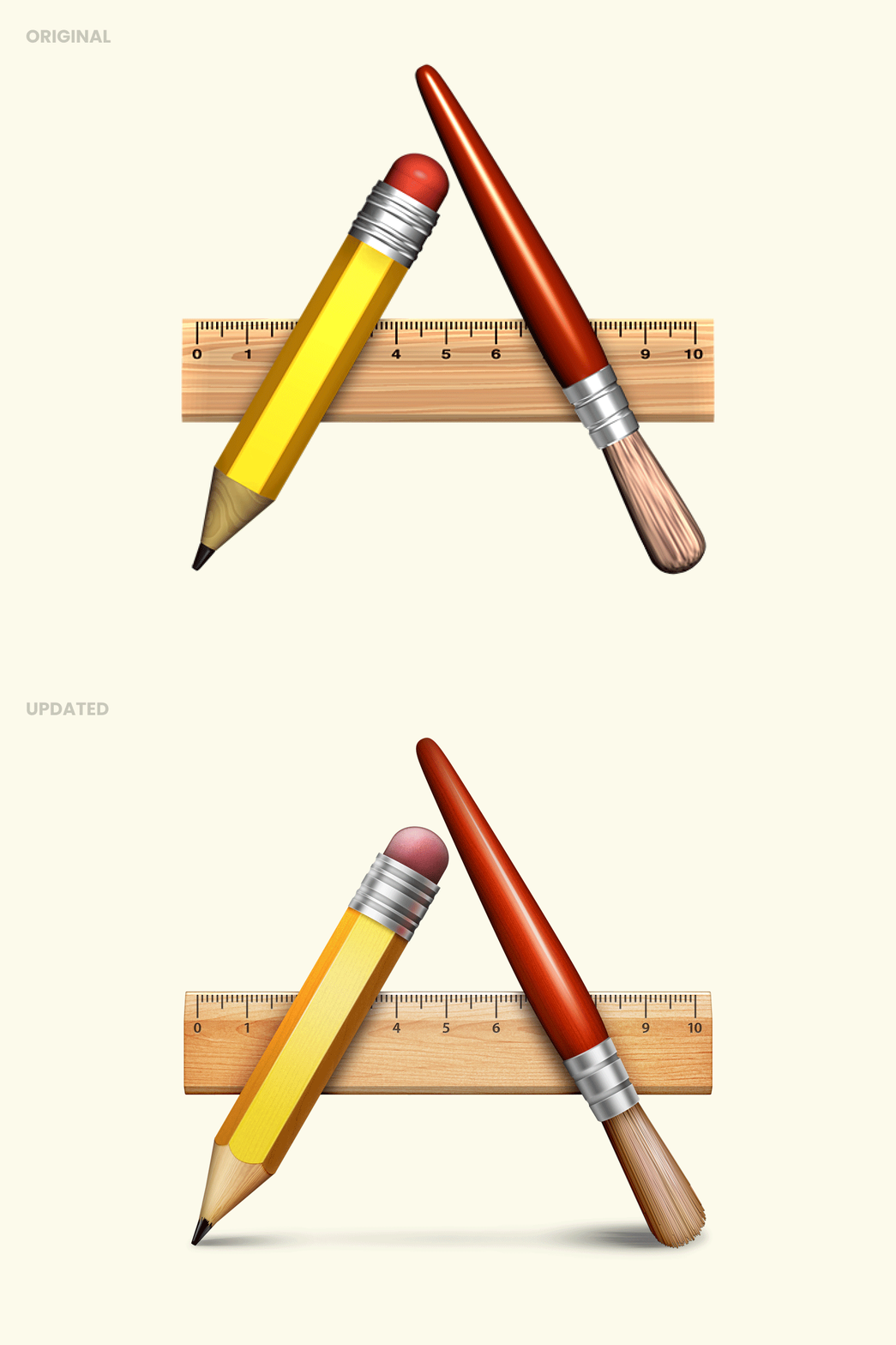
While working on the Mac App Store, we explored the idea of using the traditional pencil + brush + ruler icon which has symbolized “Application” on MacOS since forever.
I really didn’t like the original rendering of the Cinema4D icon, so before trying to integrate it in the Mac App Store icon, I decided to clean it up and redrew it.
We ended up not using this concept in the final Mac App Store icon, but I still liked my new rendering. We almost put it in the OS but in the end we changed the placeholder for apps without an icon to the one with the slanted paper, which is more inline with the HIG.
,UI自学网站,学UI