来源:网络 作者:Stuart Regan

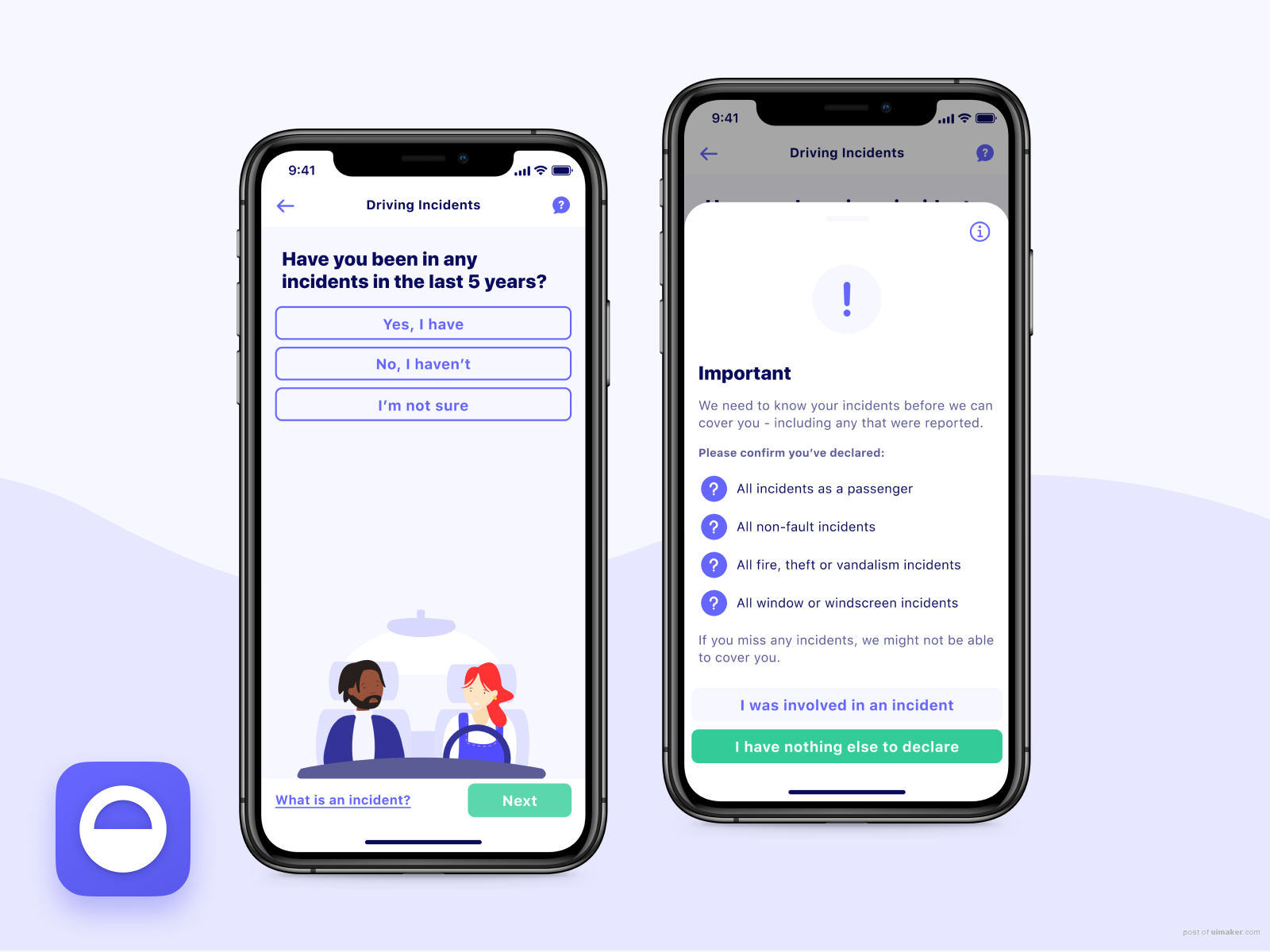
We recently released a better way to declare driving incidents on the Cuvva app. Some users were struggling at this screen, giving us the wrong details and having to chat to us to fix it. So we decided to improve the experience. We improved the copy, making it clearer. And we added an option to guide users to more information with the ‘I’m not sure’ button. Since it went it live we’ve seen an increase in users successfully getting through this section, making the overall experience much better.
You can now see this in both the Android and iOS apps.
· · ·
We’re hiring!
Want to join our growing team of designers and engineers? Come and join us make insurance better.
Apply at https://cuvva.com/careers
,PNG图标,UI设计介绍