来源:网络 作者:Max Rudberg


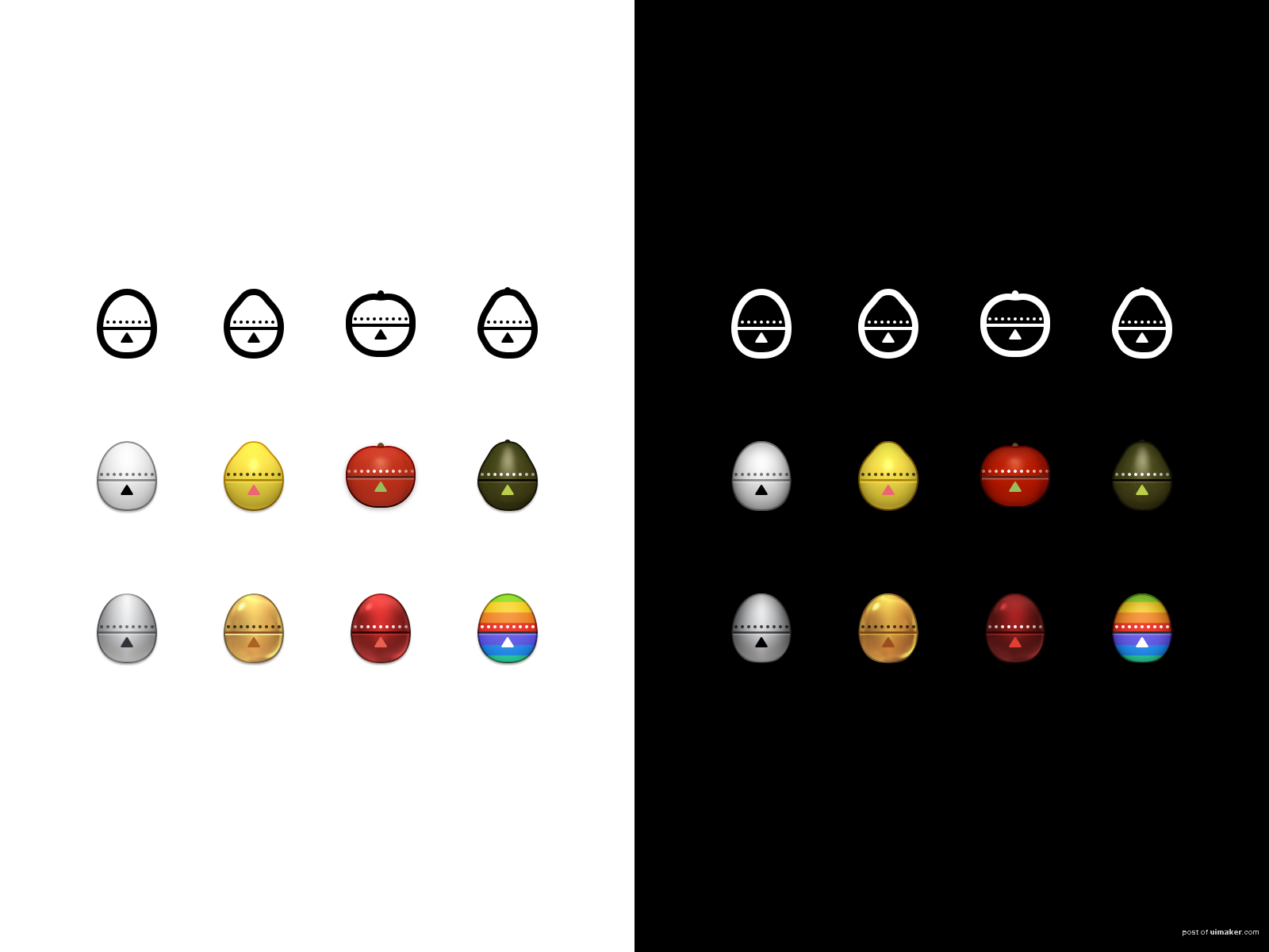
We’ve taken a look at our recipe UI and decided the timer should move into the navigation bar. In order to remain legible at such a small size, I’ve redrawn them.
My initial thought was that they had to go flat, and that resulted in top row of icons. Eventually I decided that lost too much character, and realized the enhanced details of the flat icons could be married with the detailed version of the timers.
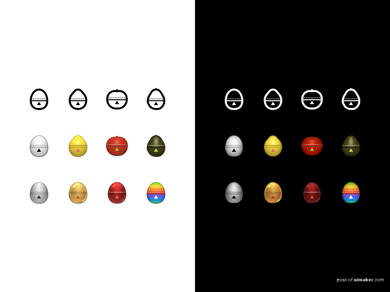
Have a look at the second shot for actual size (@2x).
,学UI好吗,学UI好吗