来源:网络 作者:Cody Ramsey

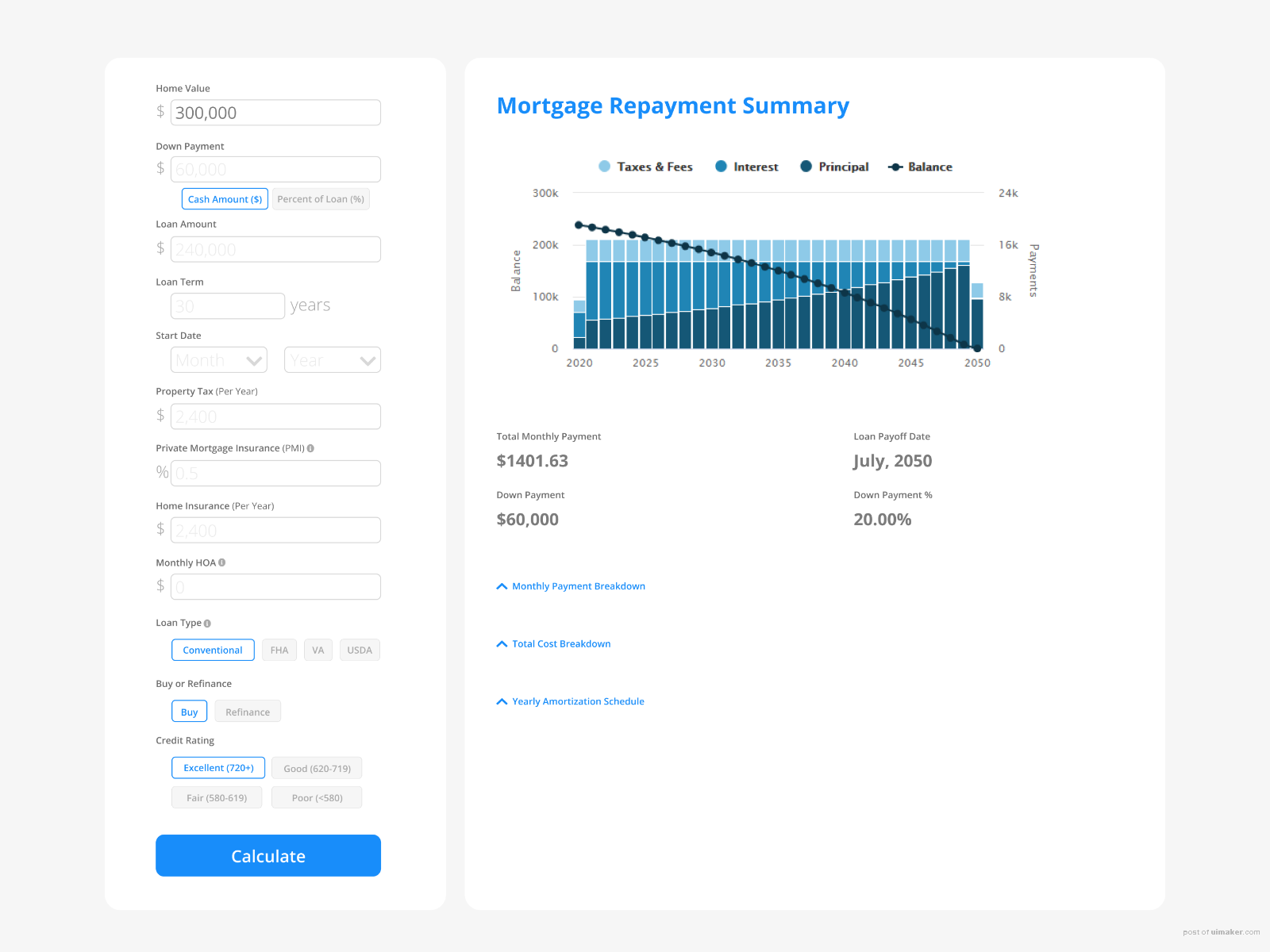
Daily UI Challenge #004. Partial redesign of . I love using this tool, just some added some user experience improvements by eliminating dropdowns and updating the user interface. Dropdown fields have been replaced with text radio buttons. Text radio buttons are much more clear to users. They show exactly which option they are selecting and don’t hide the information as a traditional drop-down menu would.
Prompt: Design a calculator. Standard, scientific, or specialty calculator for something such as a mortgage? Is it for a phone, a tablet, a web app?
Try Yourself: https://www.dailyui.co/
,如何自学UI,UI设计教程及步骤