来源:网络 作者:Purrweb UI

The team is available for new projects! Drop us a line: | WhatsApp | Website
What’s up, guys? Have you managed to get fit for this summer or delayed it till the next? Check out our attempt to design an app for doing sports.
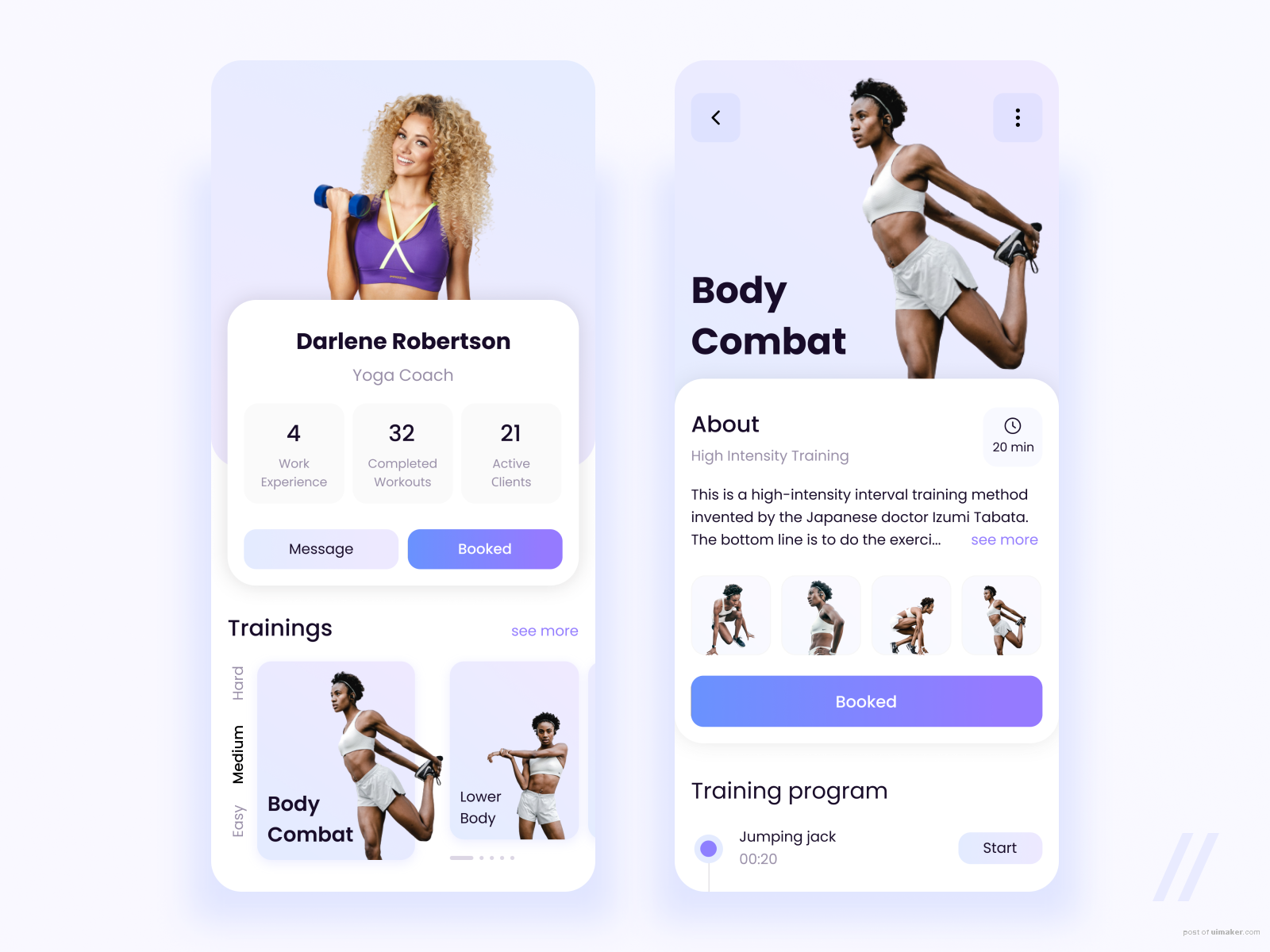
♀On the first screen, it’s a trainer’s profile ― here the user can book a workout or contact the trainer. Plus, obtain information on her/his experience, completed workouts, and the number of active clients.
♀Trainings, which is located at the bottom of the screen, is where the client can choose a level of complexity and a type of training they want to do. If the user taps on any of the trainings, they’ll see a description of it and the Book option (in addition, there is a detailed plan of exercises).
Light background + violet elements + gradient = looove. It conveys an atmosphere of good spirits and energy.
It’s easy to train online from anywhere.
Created by Valery Boyko
Press L if you like this design and share feedback!
,UI设计介绍,UI设计实战教程